Human-Centered Design Supports Communities, Too
Georgia Tech’s Design Bloc collaborated with Hunter Hills, a historic neighborhood in the heart of Atlanta, to create new branding that would unite the community.
Design Bloc is an innovative group at Georgia Tech, directed by Wayne Li, the James L. Oliver Professor in the Colleges of Design and Engineering.
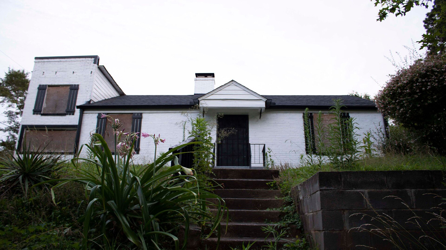
According to the Hunter Hills Neighborhood Association, the historically Black community is one of the earliest planned Black communities in Atlanta. McLendon Hospital, the city’s first Black hospital, still stands in the community today, and the neighborhood is adjacent to the Atlanta University Center Consortium.
As part of ongoing community restoration projects, the neighborhood seeks to replace outdated signage and add branded assets that reflect the identity and values of the area. Community members needed a contemporary brand that honors their history and values.
Design Bloc had already done a Proctor Creek watershed project in their Vertically-Integrated Projects (VIP) Community Studio and our Mechanical Engineering/Industrial Design studio. The VIP studio course challenges student teams to apply design thinking within real-world projects for Atlanta-area industry and non-profits.
Through the watershed project, they met Char Johnson, then Hunter Hills Neighborhood Association president, who suggested the branding project as future work together.
Design Bloc committed to support the community’s branding needs during the 2021-2022 academic year.
To do so, the staff had to be aware of the context of the community. The neighborhood has its historical context in Atlanta and the Civil Rights movement, and, unusually for Atlanta, some families have very personal context, having lived in the neighborhood for generations.
“Truly getting to know who you’re designing for, their cultural values and beliefs, is both inspirational and challenging,” said Li.
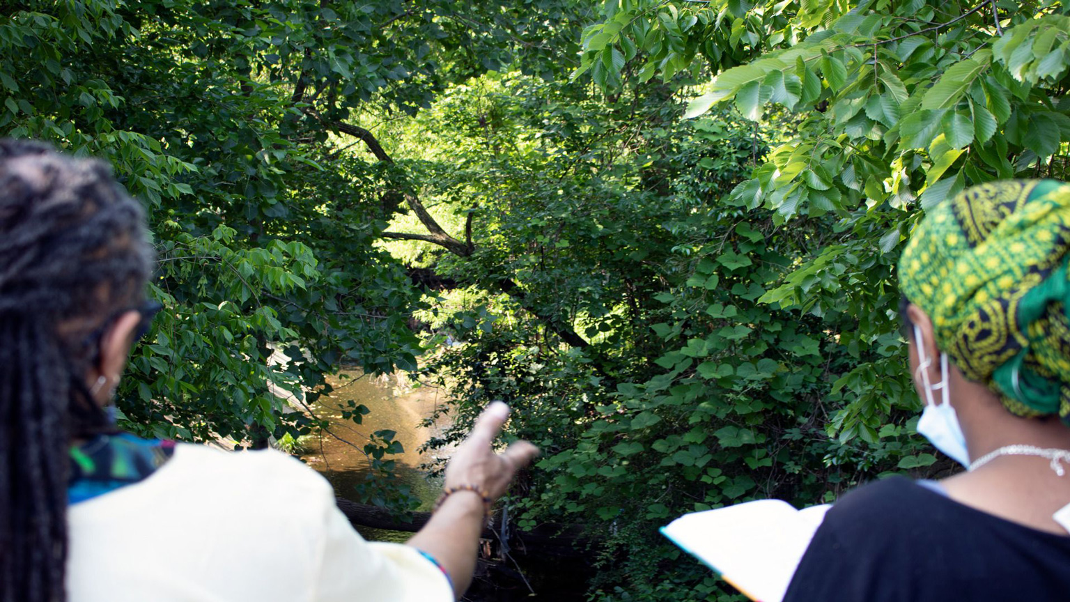
To meet this challenge, designers spent the first phase of the project in research. Through conversations and directly observing community landmarks and features on neighborhood walkarounds, Design Bloc staff learned the history and enduring values of Hunter Hills from the residents.
Of the 23 residents interviewed, 10 were legacy residents having decades-long ties to the community.
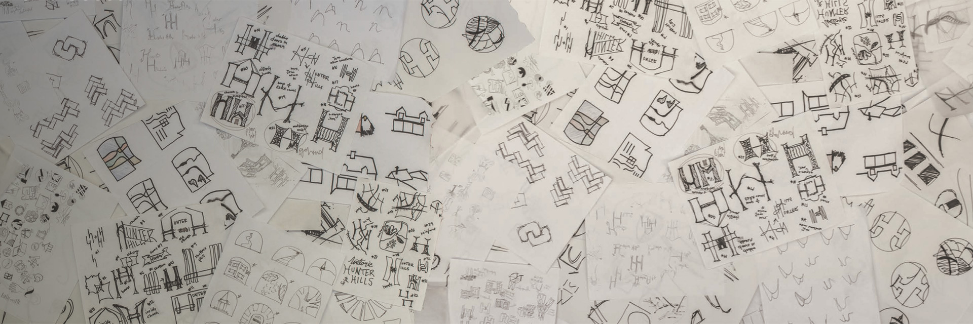
After the research phase, the team developed brand imperative statements, core values, and moodboards. To make sure they were still capturing the story and essence of the Hunter Hills community, the team hosted co-design workshops with the community to iterate on these elements.
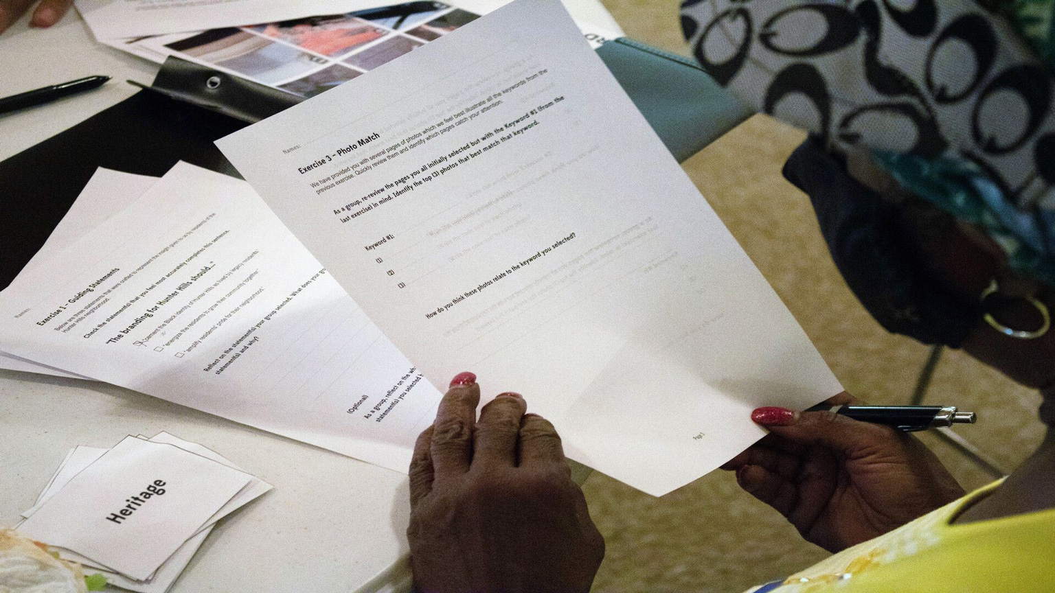
Throughout the process, the focus remained on the residents' understanding of the neighborhood.
According to the brand book, during the workshops, residents shaped the brand, residents ranked core values for Hunter Hills, residents paired the core values with images, and finally, residents shared their top choices with the staff.
The Hunter Hills core values are:
- Reverent: We are devoted to the stewardship of the neighborhood.
- Cooperative: We work together to accomplish more for our community.
- Supportive: We respond to the needs of our neighbors.
- Self-assured: We believe in the inherent worth of our neighborhood.
The final branding embodies these values.
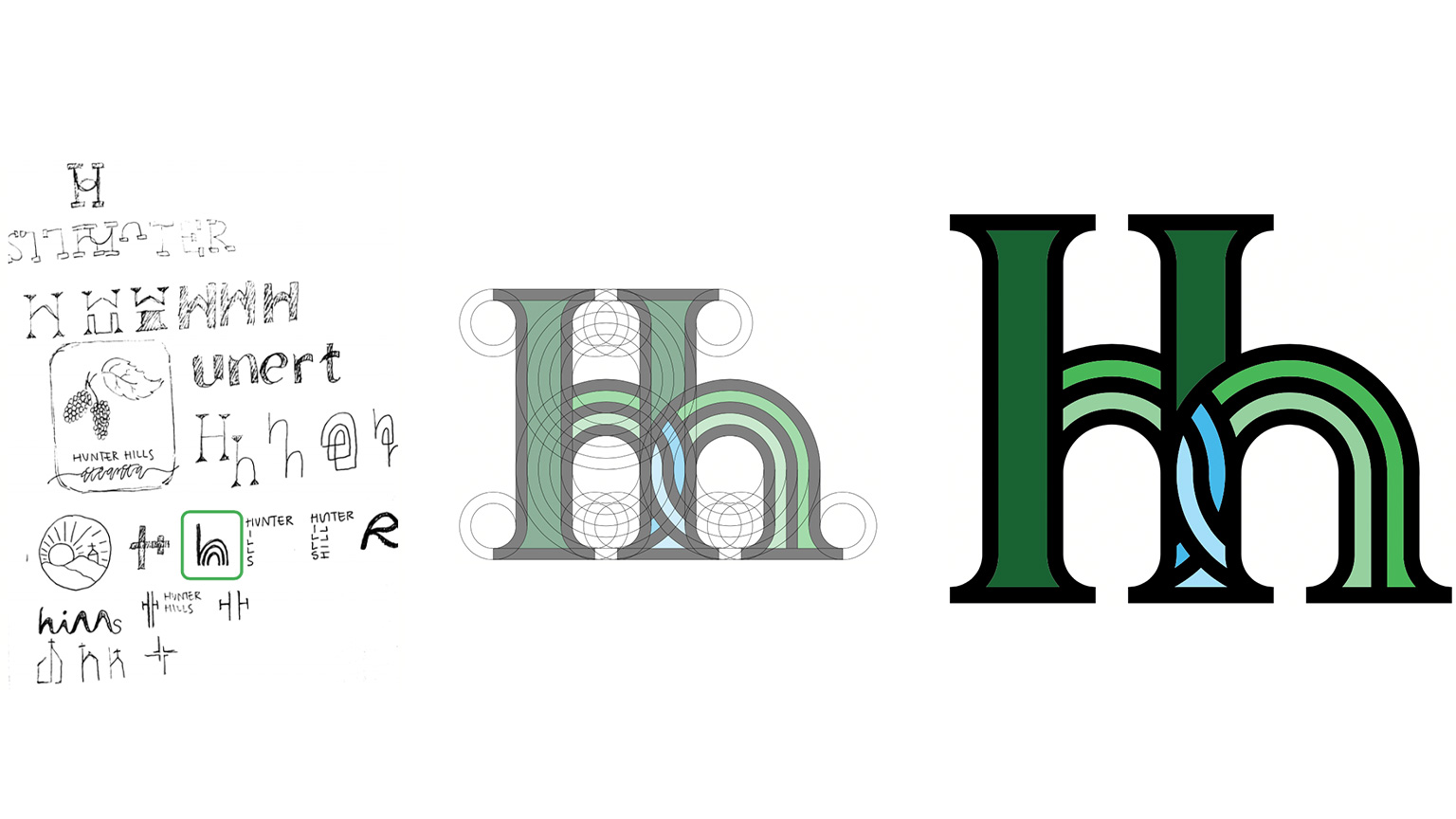
Design Bloc explained the logo fully in the brand book they delivered to Hunter Hills:
Dubbed “Heritage”, the logo of Hunter Hills combines visual references to each core value. It graphically realizes the spirit of Hunter Hills.
3 visible h’s stand for Historic Hunter Hills. The thickness of the letters represents the reverence of the community. The large H, accompanied by the smaller h’s, symbolize the generations found in the community.
Striped curves represent the hills, with overlapping circle-parts symbolizing the support the residents have for each other. The heart forms a steeple-shaped point, in reference to the church at the center of the neighborhood. The shades of blue represent Proctor Creek and their overlap shows cooperation found in the community.
Along with the logo, the brand book designates branding color values and iconography based on the logo. Design Bloc also provided instruction for asset use, including logo variations, spacing, and size for brand consistency and accessibility.
The Design Bloc will continue working to strengthen the bonds between the community and Georgia Tech while also helping teach community members design thinking and how it can empower them.